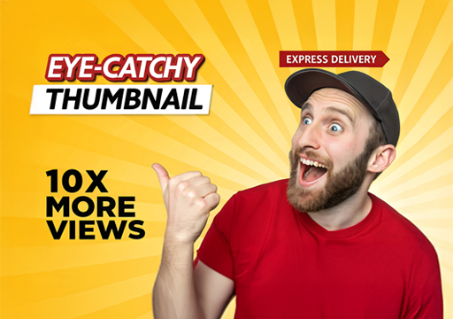
“First impressions are lasting, and a thumbnail showcases the true essence of your content.” In today’s fast‑scrolling digital world, your thumbnail is the first impression of your content. Whether it’s a
YouTube video, blog post, reel, or tutorial, a powerful thumbnail can be the difference between getting
ignored and getting clicked.
Why Thumbnails Matter More Than Ever
Thumbnails act as visual headlines. Before users read a title, they see your thumbnail. Platforms like
YouTube, LinkedIn, and even Google Discover heavily rely on visuals to influence clicks.
A good thumbnail: – Stops the scroll – Creates curiosity – Communicates value instantly – Builds brand recall
A bad thumbnail: – Gets skipped—even if the content is excellent
01. Focus on One Clear Message
One of the biggest mistakes creators make is trying to say too much in a thumbnail.
Best practice: – Highlight one idea, benefit, or emotion – Keep text short (2–5 words max) – Let visuals do
most of the talking
👉 Example: Instead of: “10 Best Thumbnail Design Tips for YouTube Growth”
Use: “More Clicks!” or “Stop the Scroll”
02.Use High Contrast Colors
Contrast is what makes a thumbnail readable at small sizes.
Effective color combinations: – Yellow on black – White on dark blue – Cyan with black accents – Red
highlights for urgency
Tips: – Avoid dull or similar tones – Use brand colors strategically – Keep the background simple
🎨 Pro tip: At Creative Hive Graphics, We always test thumbnails at mobile size first.
03.Human faces naturally attract attention.

Why faces work: – Builds emotional connection – Adds relatability – Enhances curiosity
Use expressions like: – Surprise 😲 – Confidence 😎 – Shock 😱 – Curiosity 🤔
Make sure expressions match the content—fake reactions can reduce trust.
04.Strong Typography = Instant Clarity
Typography can make or break a thumbnail.
Thumbnail font rules: – Use bold, sans‑serif fonts – Avoid thin or script fonts – Keep spacing tight but
readable
Recommended font styles: – Bold grotesk fonts – Clean modern sans fonts – Condensed fonts for impact Remember: If the text isn’t readable in 1 second, it won’t work.
05.Create Curiosity (But Don’t Clickbait)
Curiosity increases clicks—but misleading thumbnails kill long‑term growth.
Smart curiosity tactics: – Partial information – Visual hints – Question‑based text
Examples: – “This Changed Everything” – “Nobody Tells You This” – “Big Mistake!”
🚫 Avoid overpromising or false visuals—it hurts retention and credibility.
06.Use Visual Hierarchy
Your thumbnail should guide the viewer’s eye.
Hierarchy order: 1. Main subject (face/object) 2. Bold text 3. Supporting elements
Use: – Size differences – Contrast – Directional elements (arrows, circles)
This ensures your message is understood instantly.
07.Stay Consistent With Branding
Consistency builds recognition.
Brand elements to maintain: – Color palette – Font style – Layout structure – Logo placement (optional)
When users recognize your style, they’re more likely to click—even before reading the title.
08.Test, Analyze & Improve
The best thumbnails come from testing.
What to test: – Text vs no text – Face vs object – Light vs dark background – Color variations
Track: – Click‑through rate (CTR) – Watch time – Audience retention
Small tweaks can lead to big performance gains.
Final Thoughts
A great thumbnail isn’t just about looking good—it’s about strategic design. When creativity meets clarity,
clicks follow.
High‑impact thumbnails that: – Increase engagement – Match
brand identity – Convert views into loyal audiences
If you want thumbnails that actually perform, not just decorate